Monthly sessions
46K
Average service traffic

Simplifying fit-note submissions, increasing digital uptake by 9.7pp
Simplifying fit-note submissions, increasing digital uptake by 9.7pp
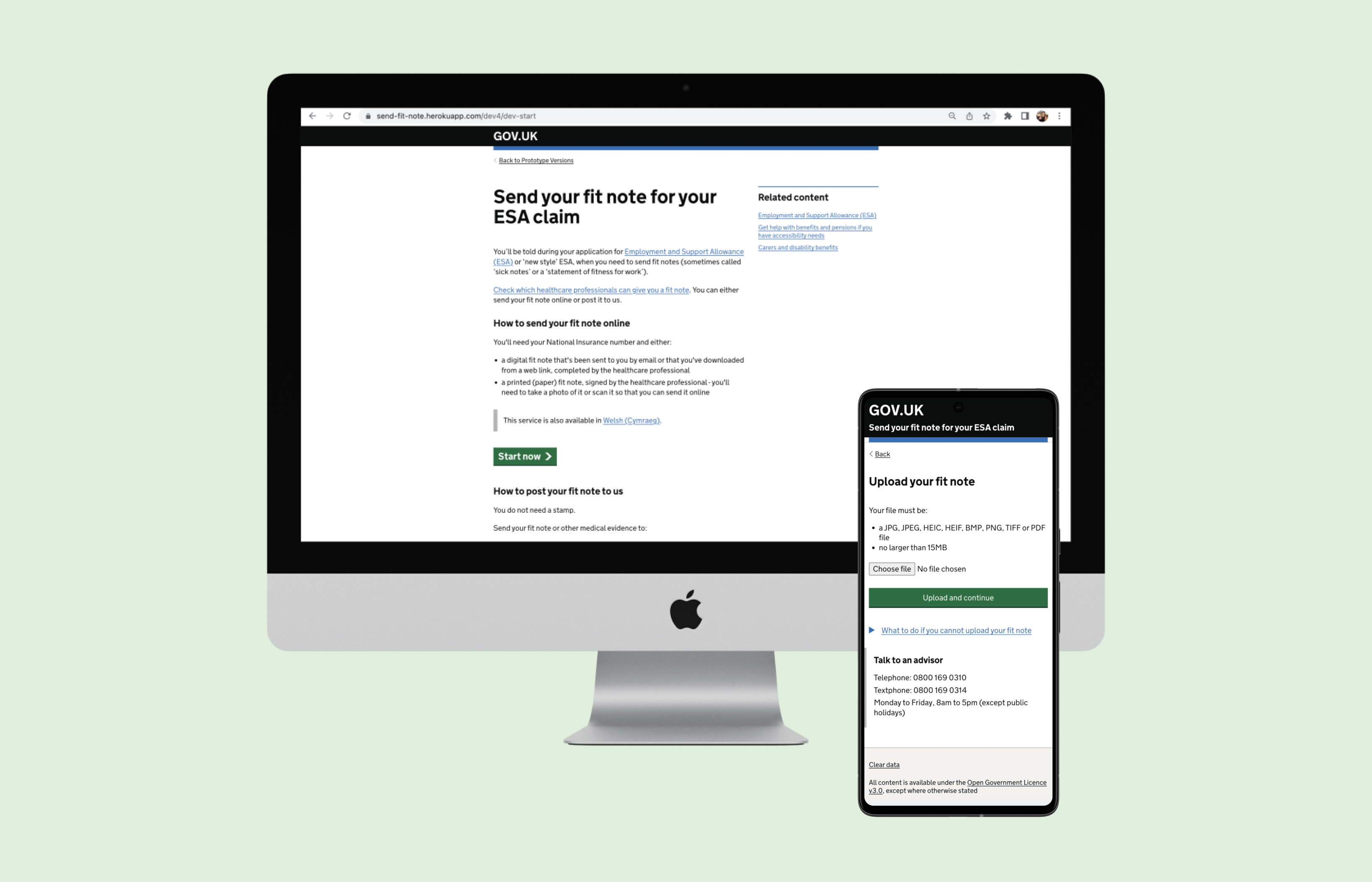
This case study shows my work on a government benefits service, enabling 500,000 - 700,000 citizens each year to submit fit notes and access financial support.
Average service traffic
Increase after launch
Increase after launch
Citizens need to submit fit notes as evidence for their benefit claim, but face significant difficulties when doing so. Through research, we found that primary users are likely to submit their fit note several times due to a recurring health condition.
Andy, who has chronic health conditions, relies on government support to manage his living expenses. He wants to ensure he receives the benefits he needs to maintain his financial stability.
Begins benefits claim and obtains a fit note from the doctor.
Reads instructions. Selects either paper or digital fit note. Follows guidance.
Selects the correct format. Uploads the fit note. Asks for help from friends or family if needed.
If successful, Andy gets a text notification, and the fit note is sent for processing. Otherwise, he must post it manually.
"What do I need to do here?"
"Seems clear enough"
"Wait, this was meant to be simple!"
"That took far too long"
My primary tools were Figma and the GOV.UK prototyping kit, which uses HTML, CSS and JavaScript. Our team's user-centred design approach was as follows:
Reviewed the feedback inbox and conducted interviews and usability testing with citizens and staff.
Assessed backend performance and user flows, identified bottlenecks, and compared similar services.
Designed low- and high-fidelity prototypes, tested them with users, and refined the journey.
Worked with content, research, development, and policy teams to align feasibility and secure sign-off.
Partnered with developers during rollout to preserve design intent and respond to delivery constraints.
| Satisfaction Score (SS) | NPS Category | Rows | Comments |
|---|---|---|---|
| 1 | Demoter | 919 | 544 |
| 2 | Demoter | 877 | 530 |
| 3 | Passive | 644 | 331 |
| 4 | Promoter | 1324 | 765 |
| 5 | Promoter | 3231 | 2597 |
| Total | 6995 | 4767 |
We prioritised addressing the demoter levels, which had 1,074 comments. The table below shows the top 20 categories. Highlighted rows show specific feature requests from users.
| Rank | Category | Occurrences |
|---|---|---|
| 1 | Communication issues | 230 |
| 2 | Difficulty uploading | 178 |
| 3 | Photo acceptance | 139 |
| 4 | General frustration | 106 |
| 5 | Phone lines general | 100 |
| 6 | Fit note not received | 94 |
| 7 | Payments | 89 |
| 8 | File type | 70 |
| 9 | Difficult to use | 65 |
| 10 | Fit note acceptance | 56 |
| Feature request: 11 | Multiple fit note upload | 56 |
| 12 | Other | 42 |
| Feature request: 13 | Digital literacy | 36 |
| Feature request: 14 | Guidance | 30 |
| Feature request: 15 | Photo orientation | 28 |
| 16 | Fit note feedback | 24 |
| Feature request: 17 | Needs extra info | 21 |
| 18 | Other channels | 21 |
| 19 | Upload preview | 20 |
| 20 | Fit note needed signing | 19 |
Visual representation of the most frequent feedback categories from users with low satisfaction scores (1 and 2).
| Category | Occurrences |
|---|---|
| Comms issues | 230 |
| Uploading | 178 |
| Photo acceptance | 139 |
| General frustration | 106 |
| Phone lines | 100 |
| Not received | 94 |
| Payments | 89 |
We combined feedback-inbox analysis with interviews involving citizens and agents, then used affinity mapping to identify the strongest recurring patterns.
The first iteration reworded the guidance to make it simpler to follow, using plain language and clearer structure so critical information was easier to find. We took it to design critique, where feedback highlighted the need to make the page shorter.
I then explored visual variants that used imagery and step-by-step prompts to guide users towards taking photos that met system requirements, while also making the page shorter. These variants tested much better in user research.
I took the revised designs through critique and heuristic evaluation, then worked with the team across several usability-testing rounds to understand which guidance people could act on.
“My mum wouldn't know what a QR code is.”
These iterations streamlined the upload experience, ensuring clearer instructions and more predictable system responses to reduce user confusion and failed submissions.
I also explored designs for handling multiple file uploads, making it easier for users to attach all of them in one go and reducing the need for repeat submissions.
After several testing rounds and iterations, we finalised the new guidance content and concepts for 'upload' pages to improve users' understanding of what's needed.
These refinements addressed user pain points by simplifying the layout, improving the visibility of critical instructions, and ensuring the process could be completed with fewer steps and less scrolling.
My design changes delivered significant results in under six months, demonstrating the effectiveness of my solutions and the value they provided.
Increase after launch
Increase after launch
Increase after launch
The final solution consolidated key guidance, optimised visual hierarchy, and reduced unnecessary scrolling. This made the process faster to complete, more accessible, and easier for users to follow without confusion.
Through accessible and thoughtful design, we empowered users to navigate the service more confidently, transforming lives and demonstrating the profound impact design can have on public services.
In live projects, using quantitative data helps you do Reach, Impact, Confidence, and Effort (RICE) scoring. This method can help prioritise design changes effectively, focusing on areas with the greatest benefit to users in the shortest amount of time. Live dashboards and A/B testing can then help validate how our design changes impact the service.
Users were told to take a screenshot of their fit note, but one user thought a 'screenshot' meant taking a photo of your screen with a separate camera. This revealed the 'curse of knowledge' bias, where we assume users understand the same things we do. This highlighted the need for simpler language and relatable analogies to support those with lower digital literacy.
Not all issues can be fixed with front-end changes. To reduce failed uploads and improve processing accuracy, we introduced key back-end enhancements. This included a HEIC file converter to support iPhone image uploads, and improvements to the scanning capabilities. These changes led to fewer errors, less manual rework, and a further 6%+ uplift in user satisfaction.