
Designing the future of contactless travel
Overview
I supported a government organisation in modernising travel and migration through two distinct workstreams. I worked with another UX designer, three user researchers, three content designers, and several business analysts and developers.
In a nutshell
- •Improved the digital immigration status service for millions of users worldwide.
- •Investigated biometric technology that can enable easy, long-term “passport-less” identity verification.
- •Made important usability and accessibility upgrades to the public-facing service and internal tools.
Challenges
- •Rigid backend architecture that restricts redesign opportunities.
- •Diverse user needs and cultural nuances, due to global use.
- •Strict security requirements for identity authentication.
Problem
The project can be broken down into two workstreams.
Workstream 1 challenges
- •Users needed a way to display their immigration status online. This mattered because some identity documents would run out by the end of 2024.
- •Users without identity documents, but who have valid reasons, faced barriers to setting up accounts.
- •Inaccessible content and jargon made it hard for users with limited digital skills or lower English skills.
- •Users had to rely on offline methods to recover their account if they lost their details.
Workstream 2 challenges
- •Building trust around users sharing their biometric data with the UK government.
- •Balancing strict security requirements with having a positive user experience.
- •Ensuring secure biometric data collection and storage.
- •Integrating biometric authentication within wider account journeys.
Opportunities
- •Create more accessible digital services for diverse user groups.
- •Focus on the 1% of users with the most complex needs, and the other 99% benefit as a result.
- •Develop innovative solutions for secure identity verification.
- •Understand user trust and sentiments towards government digital services.
Workstream 1: Process
For the digital immigration status service, we followed a user-centred design approach to ensure the service was accessible and met the needs of diverse users.
User research
- Usability testing with diverse users revealed issues and improved accessibility.
Prototyping
- Created iterative prototypes, refining user journeys from ongoing user feedback.
Accessibility compliance
- Ensured compliance with WCAG standards and best practices for digital inclusion.
Collaboration
- Worked with policy makers, PMs, and developers to align design with business goals.
The UK Government design system is available in Figma, Mural and as HTML, CSS, JavaScript and Nunjucks code. These tools helped me create high-quality visuals that align with good practices and the design system.
This setup enabled users to pause the flow on their desktop and switch to their phone. They simulated verifying their identity using a prototype of the actual app. This helped us observe how users behave and what they experience across different devices.
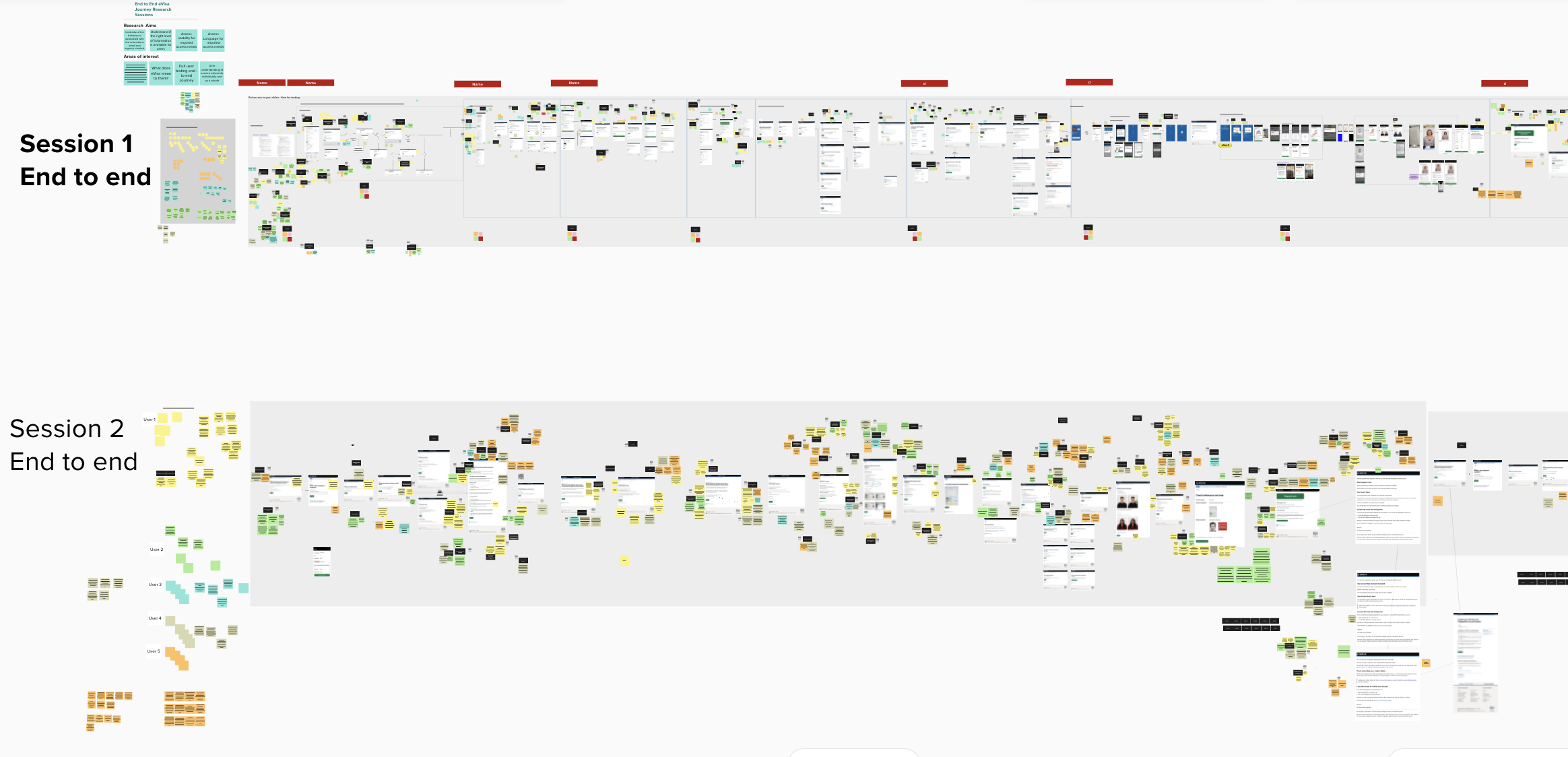
Usability testing with diverse users revealed pain points in accessibility, usability, and clarity. I iterated prototypes to address these, refining journeys through ongoing user and stakeholder feedback. Key fixes are outlined in the ‘Solutions’ section.
Workstream 2: Process
For the biometric self-enrolment trials, we focused on building user trust while ensuring robust security measures for handling sensitive biometric data.
User research
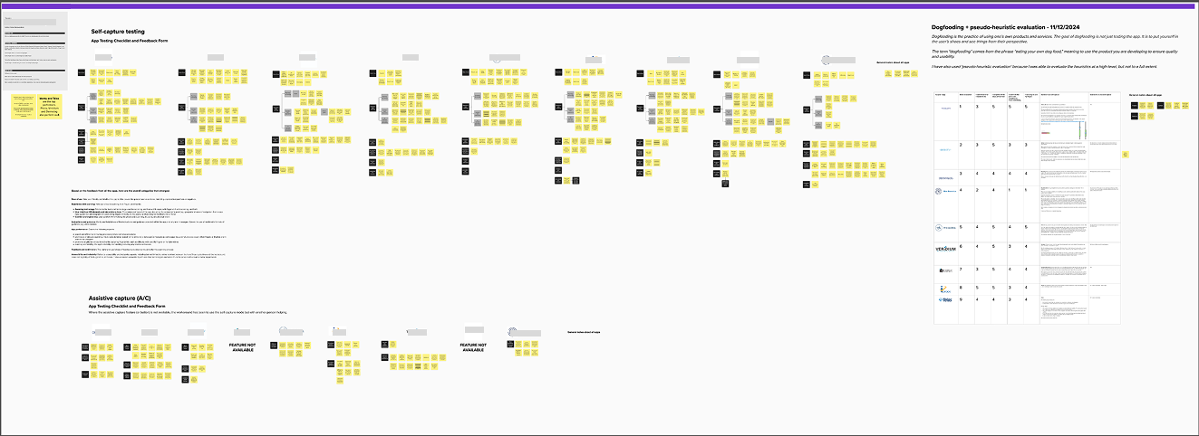
- Ran biometric trials to gauge views on remote fingerprint and facial recognition.
Prototyping
- Designed and refined biometric enrolment UI components from real-world tests.
Security & trust
- Advised app suppliers on ways to build user trust through clear messaging.
Cross-collaboration
- Worked with security, privacy, and research teams to propose robust solutions.
Due to the sensitivity of workstream two, it is not possible to go into detail or show images of what I tested or designed. For more information, please reach out to me.
Solutions
This section highlights key updates made to the public-facing and internal services. Additionally, I discuss my final outputs from the biometric self-enrolment trials.
Enhancing the live service
For the first workstream involving the immigration status service, I focused on:
- •Refining complex service steps into clear, accessible interactions for users with varied technical skills.
- •Validating the flow through usability testing, ensuring inclusivity and reliability across devices.
- •Co-designed an automated online account recovery journey to enhance self-service recovery.
Simulating fingerprint scanning
For the biometric self-enrolment trials, we assessed the feasibility of capturing fingerprints remotely using mobile apps:
- •We captured more than 200 fingerprints in two weeks. We also evaluated 9 supplier apps through detailed heuristic reviews. We checked them against WCAG (POUR) and Nielsen’s usability heuristics.
- •We authored reports for app suppliers. These reports focus on improving app accessibility, usability, and preparing for remote biometric enrolment.
- •If remote enrolment is adopted, it could save on staff and equipment costs. It would stop wasted travel when permissions are not granted. This way, people can make smarter travel choices.
For workstream one, I provided focused updates to the public service and internal platform. I improved content, simplified forms, and boosted accessibility. All changes were tested for a more inclusive experience.
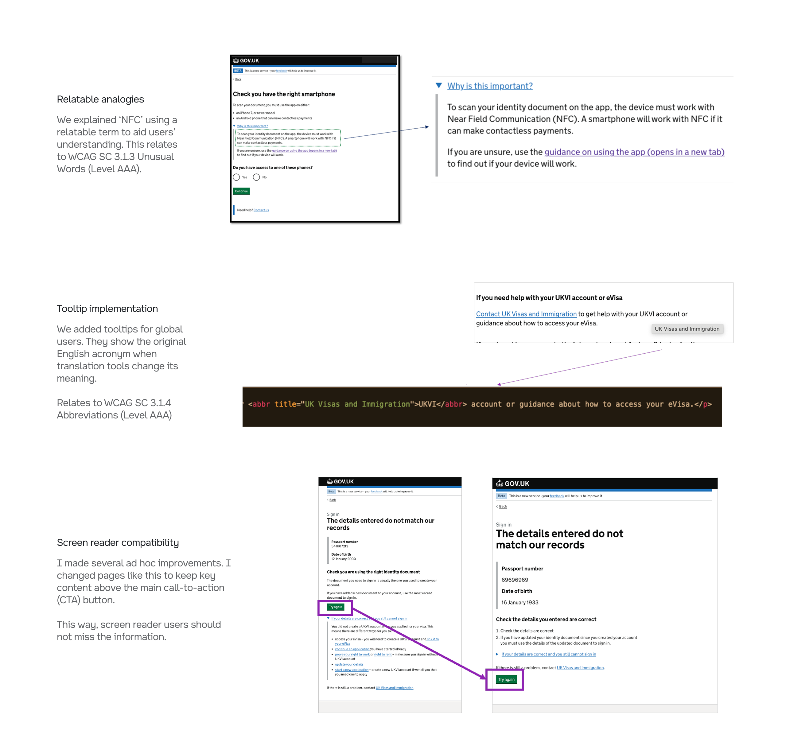
We made technical terms relatable, kept the original English for acronyms via tooltips, and moved critical content above the call-to-action. These changes improved comprehension and reduced missed information for assistive tech users.
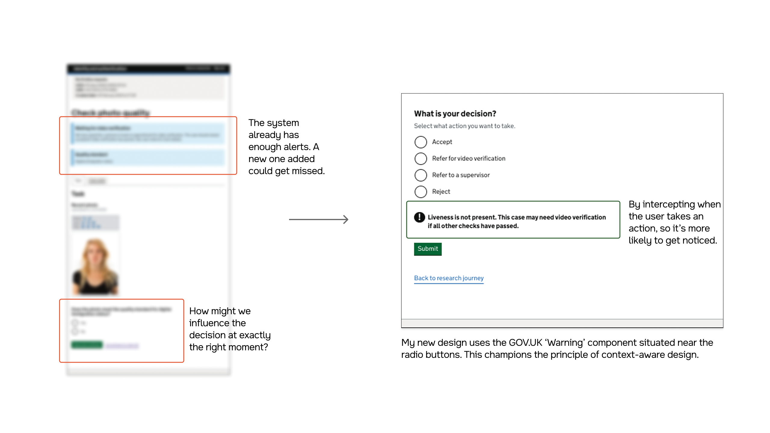
I created a way to show when a face scan is missing for valid reasons on the case working platform. I added a warning next to the decision options. This improved visibility and reduced errors without adding another easily ignored blue alert.
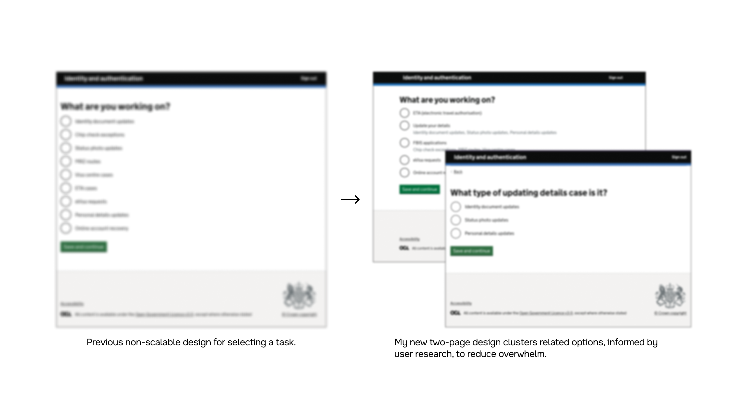
Research showed too many options on one page caused overwhelm and limited design scalability. I split the flow into two pages with short hints. This reduced cognitive load and helped users decide faster with fewer errors.
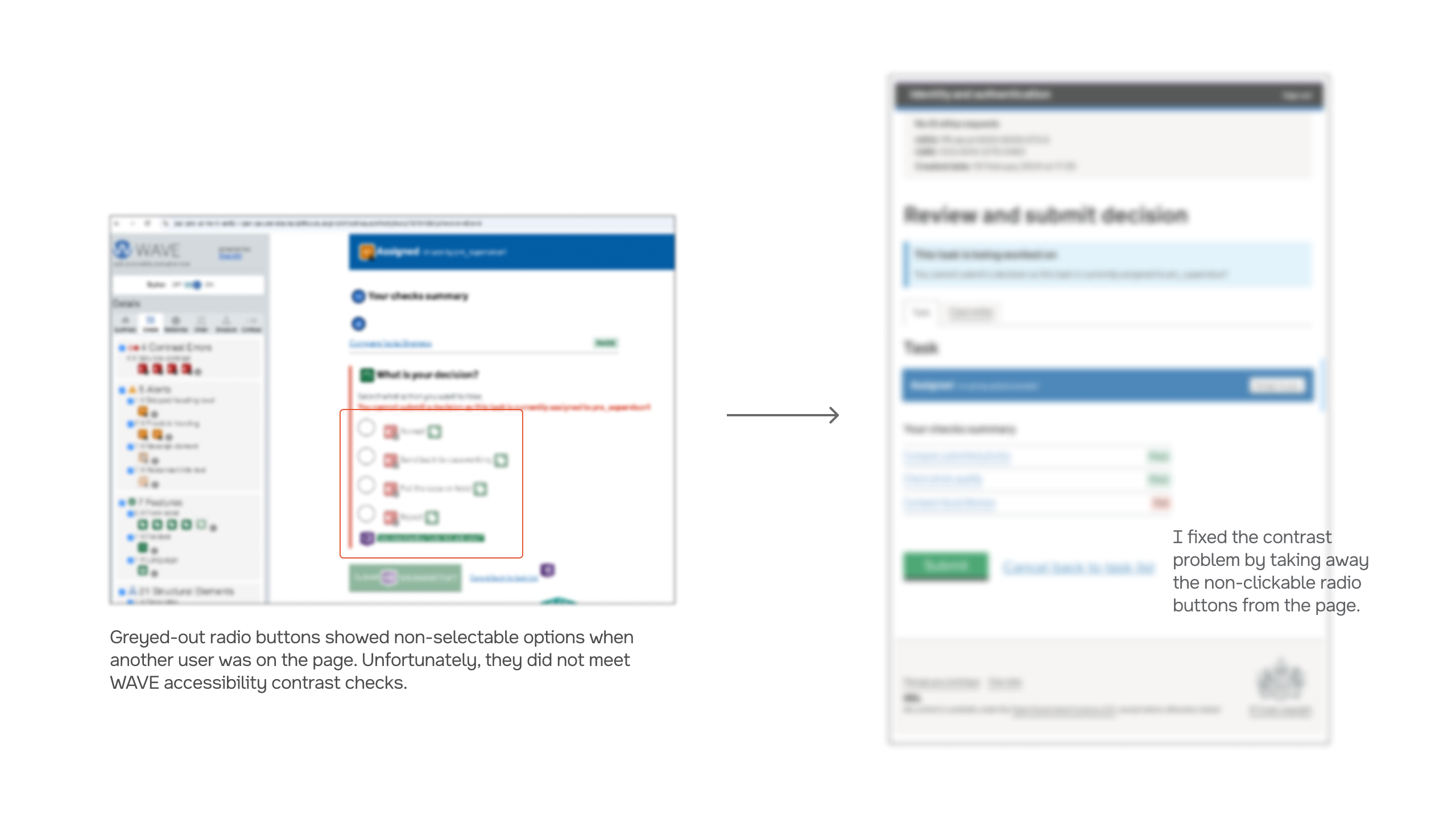
Disabled radios failed WCAG SC 1.4.3 contrast requirements (3:1 for UI components, 4.5:1 for text). I checked with users about removing the disabled radios since they had no use when another active user was viewing the case. This solved the problem.
Results
Workstream 1
We achieved a first-time GDS assessment pass, allowing the service to move to public Beta.
- •Over 7 million users worldwide can now prove their immigration status digitally
- •Simplified content and added tooltips for acronyms through inclusive language design
- •Co-designed and prototyped an automated account recovery flow, reducing offline requests by 67%
Workstream 2
Enhanced user trust in biometric authentication systems, achieving 100% willingness to join follow-up enrolment trials.
This will make things so much easier. I won't have to travel for 2 hours to do this, I can just do it at home.
Conclusion
Balance technology with human needs
While implementing cutting-edge technology was important, we learned that the most successful aspects of the solution were those that addressed fundamental human needs. Features that reduced anxiety, saved time, and provided clear information were more valued than technically impressive but less practical capabilities.
Inclusive design is essential
Designing for the extremes of user ability benefits everyone. By focusing on accessibility for users with disabilities, we created a more intuitive system that all travelers found easier to use, regardless of their digital literacy or physical capabilities. By adopting an omni-channel design approach, we ensured the service works for users regardless of device access.
In-person testing offers special insights
Our most valuable insights came from in-person testing, where observing real users with fingerprint scanning apps revealed human factors issues missed in remote testing. For example, we learned that 'thumb' is not a word recognised by people in some countries - it may be called 'big finger'. Additionally, we learned suppliers should design flows that let users without some of their fingers skip certain steps.